

Where the Mountain Meets the Ocean: Crafting the Brand Identity for Mont and Sea
When a restaurant's concept is as poetic as its produce, the branding has to match. Mont and Sea — a Gold Coast dining experience rooted in Japanese culinary philosophy and Australian coastal bounty, needed a visual identity that could carry the weight of that story. What Bounty Co. delivered was more than a logo. It was a complete brand language born from the intersection of two worlds: the rugged Australian land and sea, filtered through the refined lens of Japanese design.
The Brief: Australian Produce, Japanese Soul
Mont and Sea came to Bounty Co. with a clear but layered challenge. The restaurant's chef — Japanese-born and classically trained — sources ingredients almost entirely from the local Gold Coast hinterland and coastline. The menu is an expression of place: wild-caught seafood, mountain-grown vegetables, and produce shaped by Queensland's unique geography. But the execution, the philosophy, and the aesthetic sensibility behind every dish are unmistakably Japanese.
The brand needed to honour both truths simultaneously. It had to feel organic and grounded — connected to the soil and the surf — while also carrying the visual discipline, restraint, and elegance of Japanese design tradition. No small ask.
The core creative brief distilled into five pillars:
- Freshness and organic authenticity — the brand should feel alive, not manufactured
- A visual bridge between sea and mountain — geography as identity
- Japanese art and design influence — wabi-sabi sensibility, hand-rendered mark-making
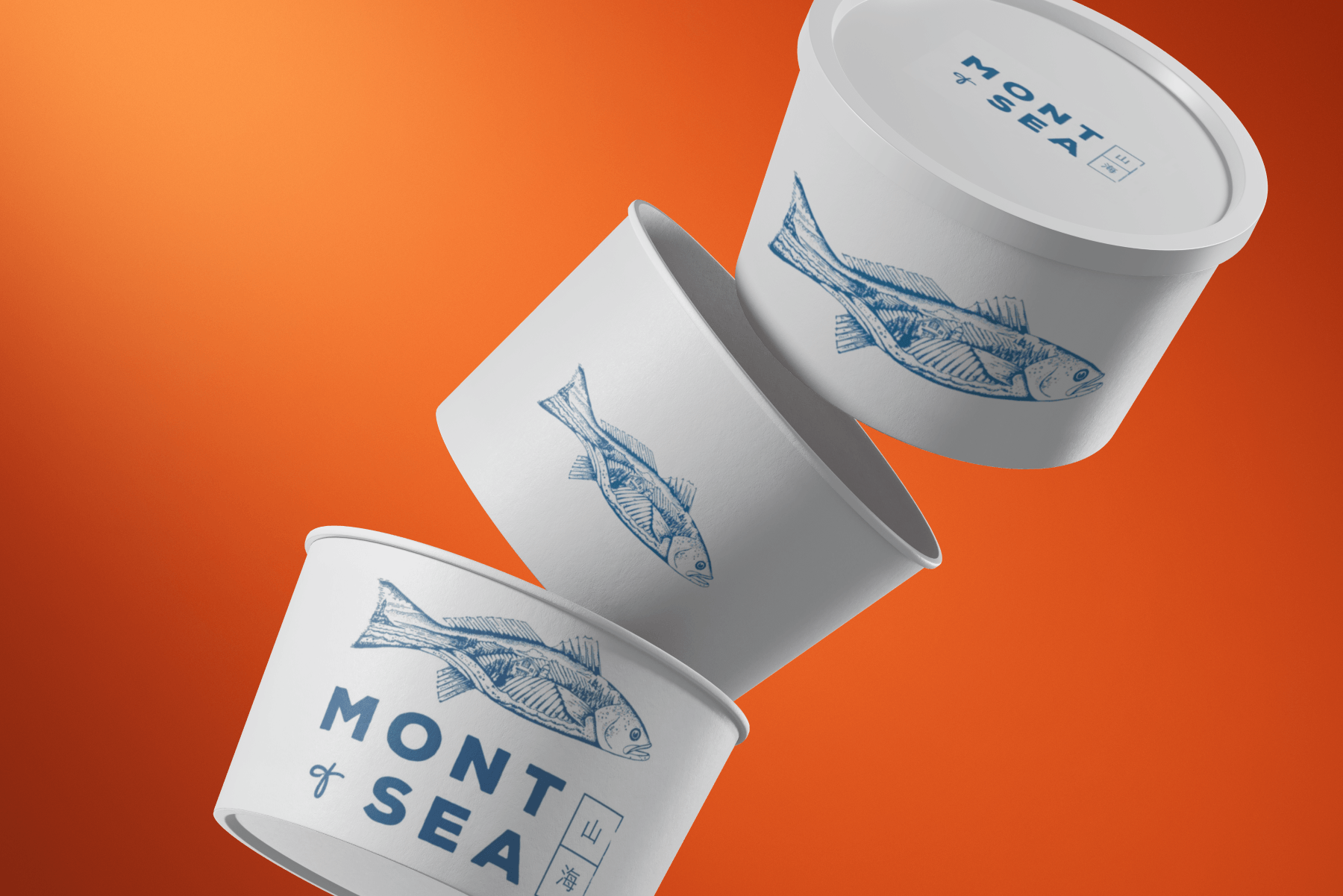
- A minimal blue and white colour palette — clean, coastal, and precise
- Rough line illustration and hand-drawn quality — warmth within restraint
The Creative Challenge: Designing for Duality
Restaurant branding in Australia has never been more competitive. The Gold Coast dining scene — once dominated by tourist-facing venues and surf-club staples — has matured dramatically. A new generation of chef-led restaurants is redefining what Queensland hospitality looks like, and they're demanding branding that can stand alongside their counterparts in Melbourne and Sydney.
For Mont and Sea, the risk of generic minimalism was real. Many Japanese-influenced Australian restaurants default to a kind of sanitised zen aesthetic: thin black lines, white space, the occasional cherry blossom. Beautiful, perhaps, but interchangeable. Bounty Co. wanted to find something more specific — more alive.
The answer came from looking at the tradition of Japanese woodblock printing and folk illustration — art forms that are simultaneously rough and deliberate, gestural and controlled. The imperfection in the line is the point. It carries humanity. It carries time. And crucially, it connects to the Australian landscape in a way that polished digital illustration never could.
Services we provided


Mont and Sea Brand Summary
The Mont and Sea identity is built around the idea of duality — where mountain and ocean, Australia and Japan, coexist in balance. This is expressed through a hand-drawn logo featuring a mountain peak and ocean wave within the same scene. Neither dominates, reflecting the restaurant’s approach to combining local ingredients with Japanese technique. Inspired by ukiyo-e, the linework is intentionally imperfect, giving the mark warmth and a human touch. The wordmark reinforces this contrast, pairing a bold, grounded sans-serif for “Mont” with a lighter, more fluid style for “and Sea.”
The colour palette is deliberately restrained, using a deep ocean blue and a warm off-white. The blue leans toward indigo, conveying depth, precision, and a connection to both Japanese aesthetics and the Pacific coastline. The off-white introduces softness and balance, ensuring the identity feels refined rather than stark. Together, they create a clean, premium visual language that works seamlessly across print and digital applications.


Hand-rendered illustration plays a central role in the brand system. Ink drawings of botanicals, seafood, and natural forms appear across menus, packaging, and digital touchpoints. This approach draws from Japanese ink traditions while aligning with contemporary Australian design, offering a tactile, crafted alternative to more generic branding styles.
Comprehensive brand guidelines support the identity, covering logo use, colour systems, typography, illustration style, photography direction, and tone of voice. These ensure consistency while allowing the brand to scale across dining, retail, and digital platforms without losing its character.
At its core, the brand narrative is about connection between place and maker. Local Queensland ingredients are interpreted through Japanese culinary expertise, encouraging diners to see the surrounding landscape as both inspiration and resource.
The result is a cohesive and distinctive identity that positions Mont and Sea as a refined, contemporary dining experience — one that is visually compelling, culturally grounded, and true to its concept.


